

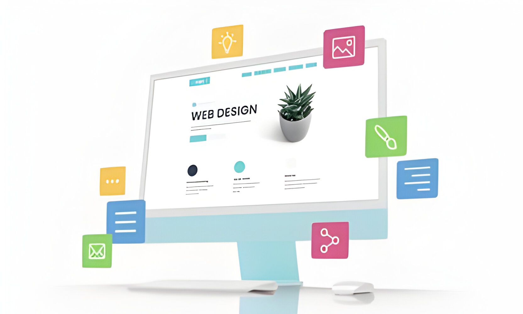
Revolutionizing the Web: Contemporary Trends in Website Design
In the digital era, the landscape of website design is continuously evolving, driven by both technological advancements and changing user preferences. Today, contemporary trends in website design focus on delivering highly intuitive, user-centric experiences that are not only visually striking but also functionally seamless across various devices and platforms.
These trends include the incorporation of advanced technologies like AI and machine learning for personalized user experiences, the adoption of minimalistic design principles to improve usability and focus on content, and the integration of interactive elements like micro-interactions to enhance user engagement.
Additionally, there's a growing emphasis on sustainability in web design, aiming to reduce the carbon footprint of digital products. This overview encapsulates a glimpse into the dynamic realm of modern website design, where innovation and user experience reign supreme.
Responsive Design: Ensuring Seamless User Experience Across Devices
The Crux of Responsive Design
Responsive design is a web development approach that creates a site or system that reacts to the size of a user’s screen. It ensures that a website can be viewed from any device, whether it’s a desktop, tablet, or smartphone, providing an optimal viewing experience. This means easy reading and navigation with a minimum of resizing, panning, and scrolling. Responsive design uses a mix of flexible grids and layouts, images, and an intelligent use of CSS media queries.
Key Elements of Responsive Design
- Flexible Layouts: The foundation of responsive design is the use of fluid grid systems that adapt and resize content based on percentages rather than pixel-based dimensions. This flexibility allows the design to adapt to any screen size.
- Media Queries: CSS media queries enable the website to use different style rules based on the characteristics of the device the site is being displayed on, most commonly the width of the browser.
- Flexible Images and Media:
This principle involves coding images and other media types to scale correctly within varying window sizes to ensure they do not distort or break the layout.
Challenges and Solutions
Developing a responsive design is not without its challenges. It requires a paradigm shift in how developers think about structures and layouts. However, the effort is well worth it. Users enjoy a seamless, consistent experience across devices, enhancing their interactions with the website. Efficient responsive design also significantly improves the site's SEO, as search engines prioritize mobile-friendly websites in their rankings.
The Future of Responsive Design
As technology continues to evolve, so too will the strategies around responsive design. With the increasing use of smartphones and the diversity of screen sizes, responsive design is more crucial than ever. It's not just about fitting on smaller screens but also about anticipating and integrating future advancements in technology, such as virtual reality browsers or devices that have yet to hit the market. Responsive design is not a trend but a fundamental aspect of modern web design.
Minimalistic Aesthetics: Simplifying Design for Enhanced Usability
The Essence of Minimalistic Design in Web Development
Minimalistic design in web development hinges on the principle of "less is more," striving for simplicity while delivering the core message to users. This design aesthetic emphasizes clean lines, ample white space, and a limited color palette to reduce cognitive load and elevate the user experience. By stripping away superfluous elements, minimalistic websites facilitate a straightforward navigation path for users, allowing them to focus on the most important content.
Advantages of Minimalistic Design
- Enhanced User Focus: By minimizing distractions, users can concentrate more effectively on the content, improving comprehension and engagement.
- Faster Loading Times: Simplified design elements require fewer resources to load, resulting in quicker website loading times which is crucial for retaining visitors and improving SEO rankings.
- Increased Usability: A clear and clutter-free layout enhances usability, making it easier for users to interact with and navigate through the website.

Implementing Minimalistic Design
To successfully implement a minimalistic design, it's essential to:
- Prioritize Content: Determine what is most important for your audience and make it the focal point of your site.
- Use Negative Space: Ample white or negative space helps draw attention to your central message and improves readability.
- Choose Color Wisely: A limited color scheme can be used strategically to guide user attention or evoke emotions.
- Opt for Simple Navigation: A straightforward navigation structure reduces complexity, making it easier for users to find what they’re looking for.
Challenges of Minimalistic Design
While attractive for its simplicity and user-focused approach, minimalistic design poses its challenges, such as the risk of appearing too sparse or impoverishing user experience by oversimplifying functionalities. Overcoming these challenges requires a balanced approach that maintains simplicity without compromising on the richness of user experience.
The minimalistic design offers a pathway to a more user-friendly website by focusing on essential elements, resulting in a cleaner, faster, and more engaging online environment. This design approach not only caters to the aesthetic and functional preferences of today’s internet users but also aligns with the practicalities of web development, pushing towards a more accessible and sustainable digital world.
User-Centric Navigation: Intuitive Interfaces for Easy Interaction
Understanding User-Centric Navigation
User-centric navigation focuses on creating a website layout that aligns with the user's intuition, making information discovery effortless and logical. This approach prioritizes the ease of finding content over the website's aesthetic or the owner's content preferences. By understanding and anticipating the user's needs and behavior, developers can design an interface that feels familiar and intuitive from the first visit.
Key Principles of User-Centric Navigation
- Consistency and Predictability: Navigation and interaction patterns should remain consistent throughout the website, fostering a sense of reliability and predictability.
- Clear Labels and Instructions: Navigational elements should be clearly labeled with familiar terms to minimize confusion and learning time.
- Feedback and Interaction: Providing immediate feedback on users’ actions ensures an interactive and engaging experience, confirming that their actions have been successful or guiding them back if an error occurs.
Strategies for Implementing Intuitive Interfaces
- Prioritize Content Hierarchy: Organize content in a logical order that reflects the importance and relationship between different sections and topics.
- Simplify Navigation: Keep navigation simple and uncluttered by reducing the number of options and maintaining a focus on essential sections.
- Implement Familiar Patterns: Use widely recognized patterns and icons for functionalities like search, menu, and home to reduce the learning curve for new users.
- Ensure Accessibility: Design with all users in mind, ensuring that navigation is accessible through multiple means, including keyboard navigation and screen readers for users with disabilities.
The Importance of User Testing
User-centric design relies heavily on feedback from actual users. Regular testing with diverse user groups provides invaluable insights into their preferences, behaviors, and challenges. Iterative design, informed by user testing, allows for continual refinement of the navigation experience, ensuring it remains intuitive and efficient for a broad audience.
User-centric navigation is not a one-size-fits-all solution but a philosophy that places the user's experience at the forefront of web design. By adopting a methodical approach to intuitive interface design, developers can create more inclusive, accessible, and enjoyable digital spaces that cater to the needs and expectations of today's internet users.
Interactive Elements: Engaging Users with Micro-Interactions and Animations
The Role of Micro-Interactions in User Engagement
Micro-interactions are small, functional animations or effects that happen as a result of the user's action or behavior on a website. These subtle cues not only enhance the visual appeal but also play a crucial role in engaging users by providing immediate feedback or guiding them through their interactions with the website. For example, the animation of a button when clicked or the way a notification pops up can make the digital environment feel more alive and responsive to the user's actions.
How Animations Contribute to a Dynamic User Experience
Animations, when used sparingly and effectively, can greatly contribute to a more dynamic and engaging user experience. They can be employed to draw attention to specific content, indicate loading processes, or simply add a layer of polish and professionalism to the website's overall design. It's important, however, to ensure animations are not overused, as excessive motion can be distracting or even detrimental to users with sensitivities or slower internet connections.
Best Practices for Implementing Interactive Elements
To effectively integrate interactive elements like micro-interactions and animations into a website, follow these best practices:
- Subtlety is Key: Ensure that interactions are subtle and serve a functional purpose, rather than being purely decorative or, worse, obstructive.
- Maintain Performance: Optimize animations to ensure they do not adversely affect the website's loading times or performance.
- Ensure Accessibility: Provide alternate navigational options for users who may prefer to reduce motion due to vestibular disorders or personal preference.
- Feedback Loop: Utilize micro-interactions as a form of feedback for the user to confirm actions, indicate loading states, or draw attention to changes in the interface.
By thoughtfully incorporating micro-interactions and animations, designers can create more engaging, interactive, and memorable websites that foster a positive and lasting impression on users. These elements, when correctly applied, have the power to subtly guide users, improve usability, and elevate the overall user experience.
Dark Mode Design: Enhancing Visual Comfort and Reducing Eye Strain
Understanding Dark Mode Design
Dark mode design refers to the implementation of a dark color scheme in the
user interface (UI), flipping the traditional light background with dark text to a dark background with light text. This design choice is not only aesthetically pleasing to many users but also offers practical benefits, including enhanced visual comfort in low-light conditions and potential reductions in energy consumption on devices with OLED or AMOLED screens.
Benefits of Implementing Dark Mode
- Reduces Eye Strain: Dark mode reduces the amount of light emitted by device screens while maintaining the minimum color contrast ratios required for readability. This can help in reducing eye strain, especially in low-light conditions, making digital content more accessible and comfortable to consume over extended periods.
- Improves Focus: By dimming the surroundings of text and multimedia content, dark mode can help improve users' focus on the content, potentially enhancing productivity and reducing distractions.
Key Considerations for Dark Mode Implementation
- Color Contrast and Legibility: Ensuring that text and interactive elements stand out against the dark background without causing discomfort is crucial. The use of softer, muted colors for text and UI elements can help prevent glare and keep the content legible.
- User Preference and Context: Offering users the option to switch between light and dark modes empowers them to select the mode that best suits their needs or preferences at any given time, enhancing the overall user experience.
- Energy Consumption: On devices with OLED or AMOLED screens, using dark mode can contribute to battery savings. However, the impact on LCD screens is negligible, and the design choice should primarily focus on user comfort rather than energy efficiency.
Final Thoughts on Dark Mode Design
Incorporating a dark mode option into digital products can significantly enhance the user experience by offering improved readability, reducing eye strain, and potentially saving energy on certain devices. By considering user preferences and the specific application context, designers and developers can implement dark mode in a way that compliments the product's overall design and accessibility goals.

Accessibility Features: Making Websites Inclusive for All Users
Importance of Web Accessibility
Web accessibility ensures that websites are usable by everyone, including people with disabilities. This involves designing and developing websites and online tools in a way that removes barriers that might prevent interaction or access to the web. By prioritizing accessibility, creators can reach a wider audience, improve the user experience for all users, and comply with legal standards.
Key Elements of Accessible Web Design
- Text Alternatives for Non-Text Content: Provide text alternatives (alt text) for images, videos, and other non-text content, allowing screen readers and other assistive technologies to describe and present this content to users with visual impairments.
- Content Structure and Semantics: Use proper HTML markup to structure content and convey meaning. This includes using headings, lists, and other elements to organize content logically, making it easier for users with assistive technologies to navigate and understand the structure of your site.
- Keyboard Navigation: Ensure that all functionalities of the website are accessible via keyboard alone. Users with mobility impairments often rely on keyboard shortcuts to browse the web, making keyboard navigability crucial for accessibility.
- Color Contrast and Text Size: High contrast between text and its background and the ability for users to adjust text size are essential for users with visual impairments. Ensuring sufficient contrast and flexible text sizes can greatly improve readability.
- Captions and Transcripts for Multimedia: Provide captions for audio and video content, and transcripts for audio-only content. This makes multimedia accessible to users who are deaf or hard of hearing, as well as those who prefer written over auditory information.
Assistive Technologies and User Testing
- Leverage Assistive Technologies: Use screen readers, text-to-speech software, and other assistive technologies to test your website’s accessibility. Real-world testing helps identify and rectify barriers that might not be obvious during the design and development process.
- Engage with Real Users: Involve people with disabilities in user testing sessions. Feedback from a diverse group of users can provide invaluable insights into the practical accessibility of your website, highlighting areas for improvement.
Legal and Ethical Considerations
Ensuring web accessibility is not just a best practice—it's a legal requirement in many jurisdictions. Aside from adhering to laws and regulations, making your website accessible is an ethical commitment to inclusivity, ensuring that all users, regardless of their abilities, have equal access to information and functionality.
Conclusion
Making websites accessible to all users is a fundamental aspect of modern web development. By implementing the above practices and continuously engaging with the community of users with disabilities, developers, and designers can create more inclusive digital environments that cater to the needs and rights of every individual.
Ready to Elevate Your Web Accessibility?
At LevelUP Digital Solutions, we're passionate about creating digital experiences that are accessible, user-friendly, and compliant with the latest standards. Our team of experts specializes in innovative web design and development solutions that ensure your website is accessible to everyone, including individuals with disabilities. Don't let accessibility barriers hold your website back. Contact us today to learn how we can help your business thrive in the digital world and make your website truly inclusive for all users. Reach out to LevelUP Digital Solutions and take the first step towards a more accessible and successful online presence.